Twitch-Integrated Game Research
Situation
As part of a selected student team, I collaborated with streamer and cosplayer Desca on a project aimed at enhancing audience engagement during her Twitch livestreams.
Task
Our objective was to design a small, Twitch-integrated game that would capture viewer attention and encourage interaction throughout her streams. To ensure our concept was grounded in proven practices, preliminary research was required.
Action
Within the group, we identified key research areas and divided responsibilities accordingly. I focused on researching existing Twitch-integrated games, analyzing how they engage audiences through interactivity, viewer participation, and stream integration. I documented my findings in a structured research document, which was compiled into a PDF and shared with the team.
Result
My research provided the team with concrete examples of successful engagement mechanics and interaction patterns used on Twitch. These insights directly informed our design decisions and helped shape a game concept that was both technically feasible and audience-focused.
Reflection
This task reinforced the value of research-driven design and collaboration. By studying existing Twitch integrations, I was able to contribute actionable insights that strengthened the overall project outcome and ensured our solution aligned with real-world streaming practices.
Concept Development: Tamagotchi-Style Stream Game
Situation & Task
After completing our initial research phase, our next step was to determine a suitable game concept that would integrate smoothly into Desca’s Twitch streams without disrupting her main content.
Action
As a team, we decided on a Tamagotchi-style virtual pet game. This concept was chosen for several key reasons:
-The gameplay is relaxed and low-maintenance, ensuring it does not distract from the stream itself.
-It offers extensive opportunities for customization, including cosmetics and visual upgrades.
-It encourages emotional investment from viewers, creating a sense of attachment that motivates them to return to future streams.
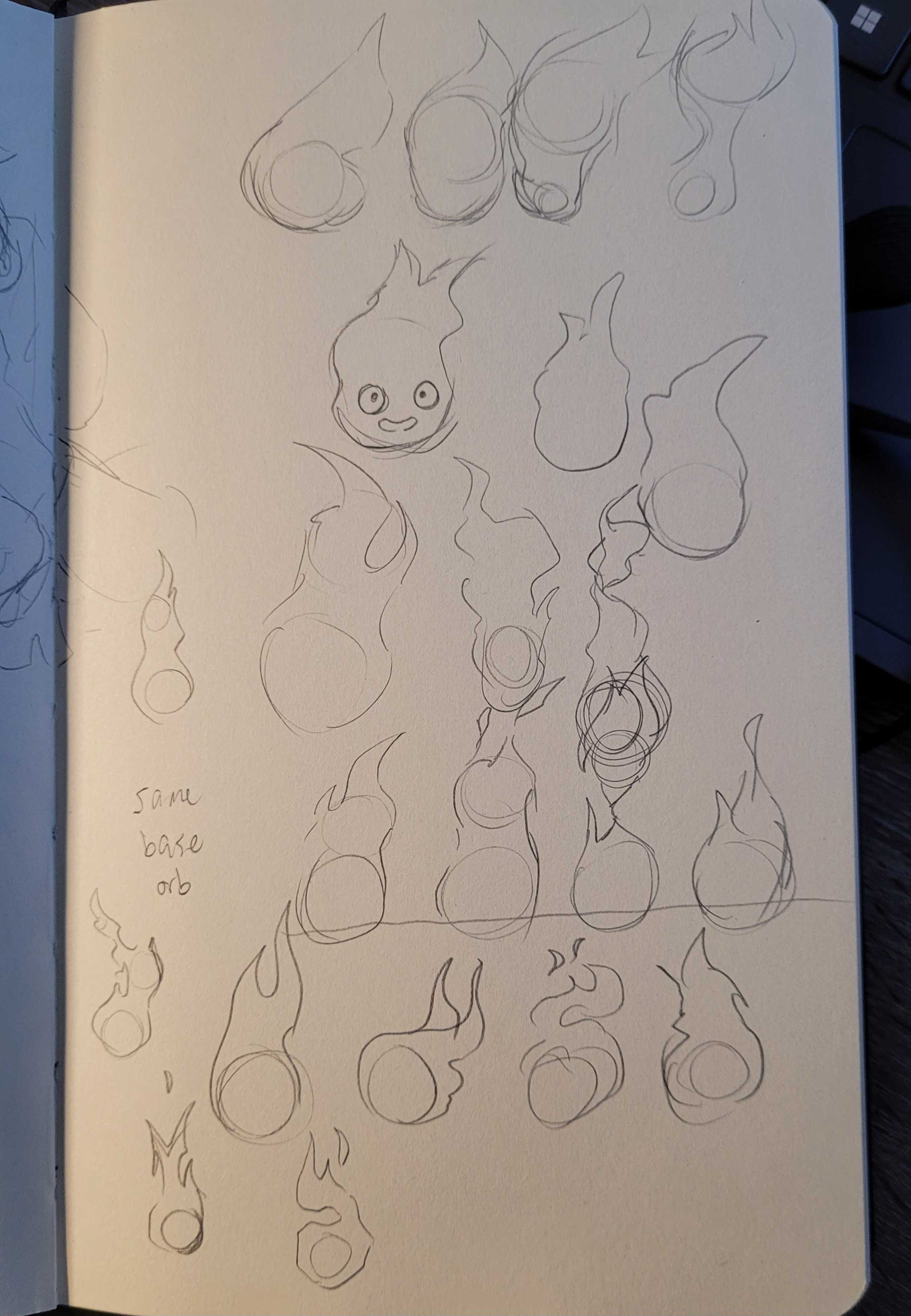
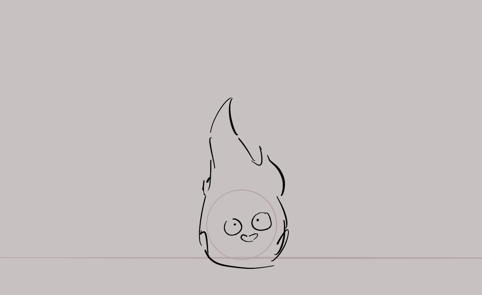
Following this decision, I produced several early concept sketches exploring potential gameplay states and visual styles for the virtual pet.
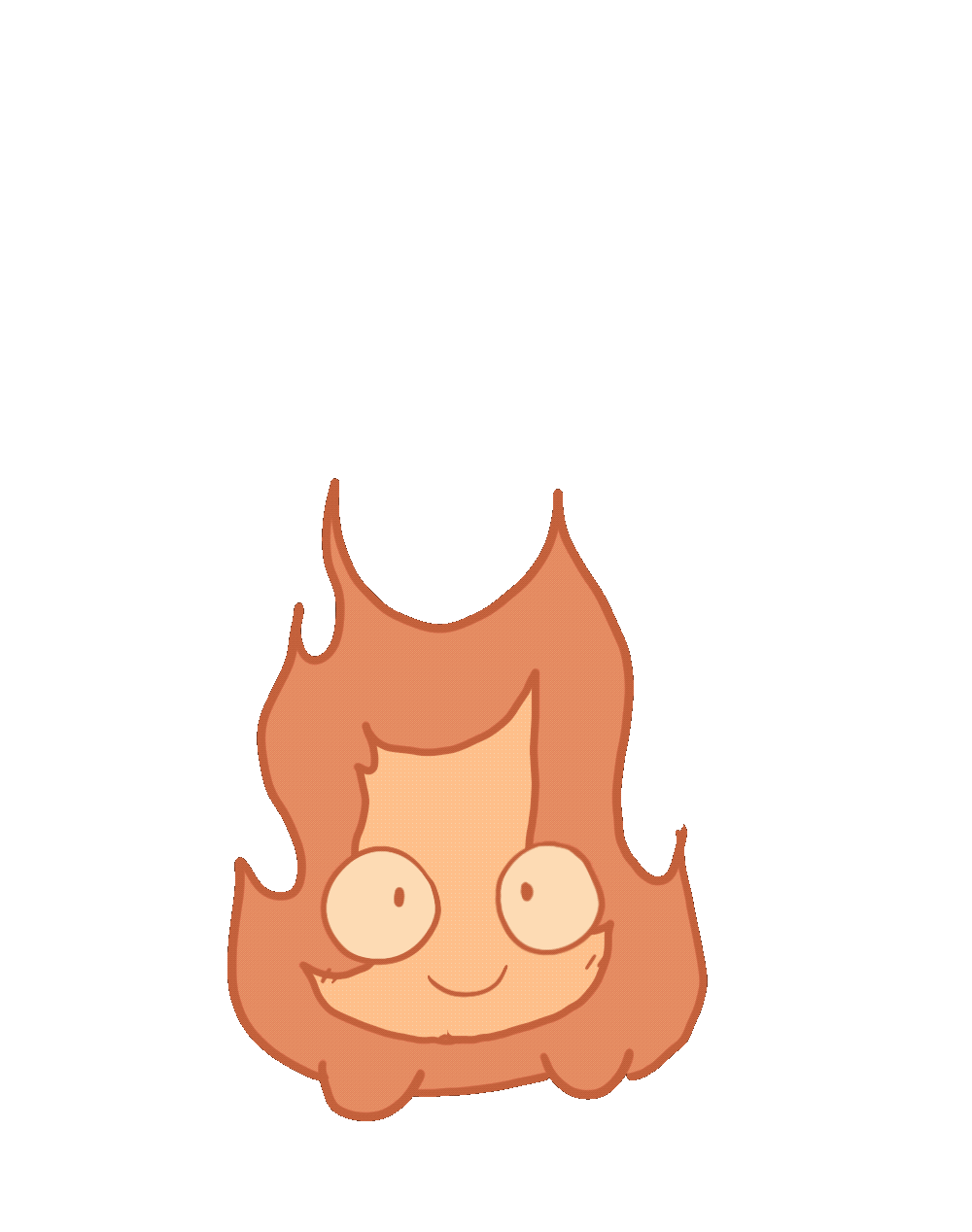
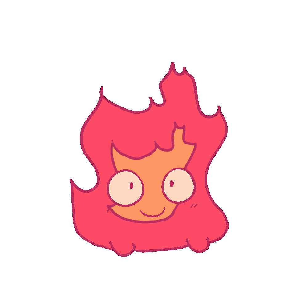
For the character design, we chose Calcifer from Howl’s Moving Castle. This character holds strong narrative significance within Desca’s existing stream lore and fan community. Additionally, Calcifer’s cartoony style and relatively simple shape language made him well-suited for a stylized, animated game character.
Result
The Tamagotchi-inspired approach provided a clear, flexible foundation for both gameplay and visual design. The early sketches helped the team align on a shared vision and served as a starting point for further iteration.
Reflection
This phase demonstrated the importance of aligning game mechanics with the context in which they are used. By prioritizing simplicity, emotional engagement, and stream compatibility, we ensured the concept complemented the live experience rather than competing with it.
Stakeholder Feedback & Concept Validation
Situation & Task
With an initial concept established, the next step was to validate our ideas with the primary stakeholder: Desca. The goal of this meeting was to gather her input, understand her personal vision for the stream, and ensure our concept aligned with her brand and community.
Action
We held a meeting with Desca in which we presented our research findings, early sketches, and the Tamagotchi-style game concept. We also asked targeted questions about her own ideas, preferences, and expectations for interactive stream content. One of my groupmates documented the discussion by creating a detailed transcript of the meeting.
Result
The conversation provided valuable feedback and clarified several design constraints and opportunities. Desca’s responses helped us confirm that the proposed concept fit her stream identity while also highlighting areas for potential refinement.
Reflection
This meeting emphasized the importance of stakeholder involvement early in the design process. By actively listening and validating our ideas with Desca, we reduced the risk of misalignment and ensured the project continued in a direction that supported both the creator and her audience.
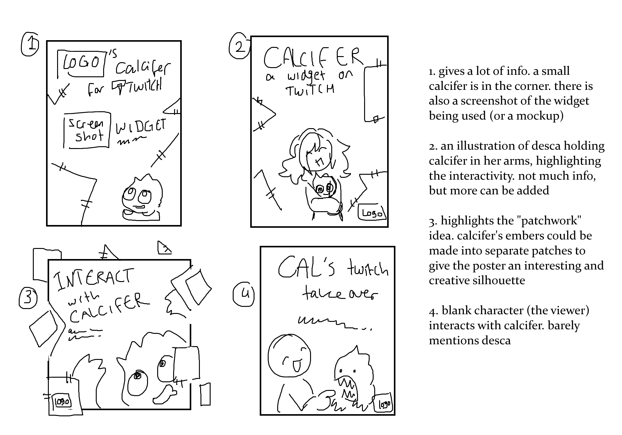
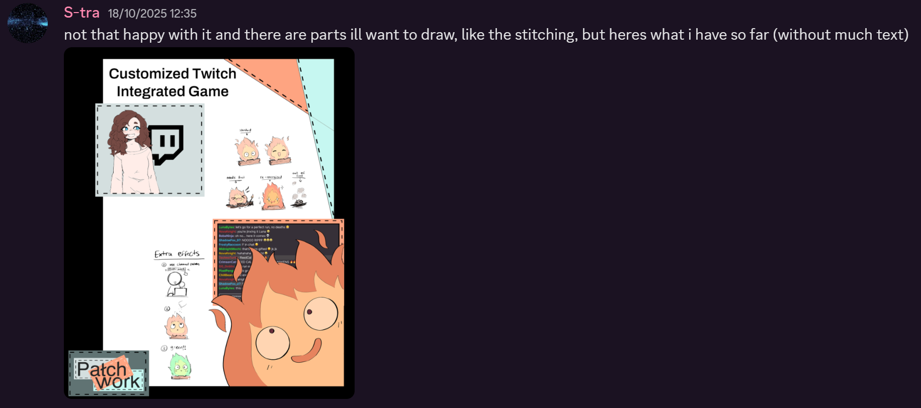
Poster Design Concept: Thinking Beyond the Format
Situation & Task
After confirming the Tamagotchi-style concept, our focus shifted to the upcoming poster showcase, which would be our first public presentation of the project. The goal was to clearly communicate our idea while also creating a strong visual impression.
Action
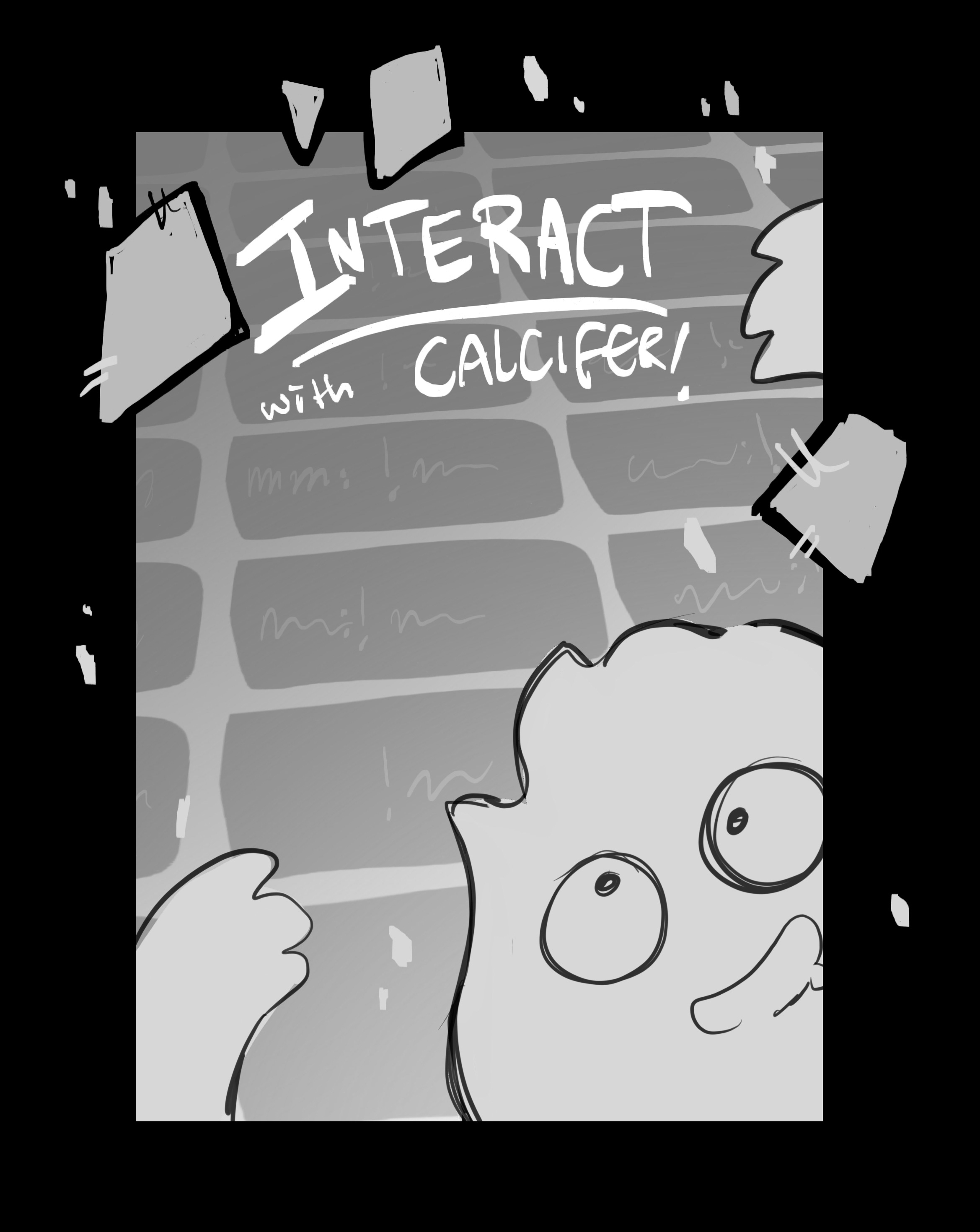
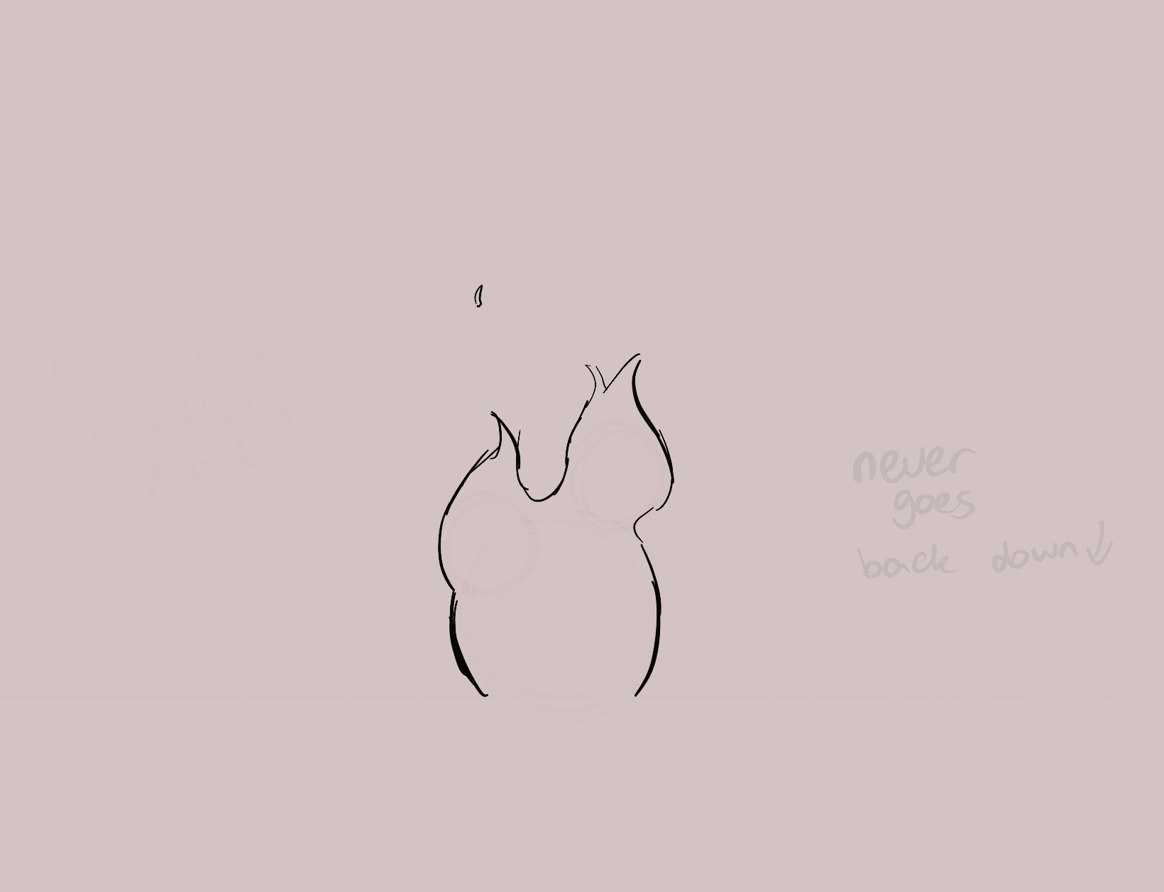
I aimed to design a poster that felt playful and memorable, reflecting both the tone of the game and our creative approach. During brainstorming, I drew inspiration from the phrase “thinking outside the box” and decided to challenge the standard A2 poster format by designing a layout that extended beyond traditional boundaries.
I created a quick concept sketch to visualize this idea. The loose, floating patches represent both our studio’s name and Calcifer’s embers, rising upward and breaking free from the conventional poster structure. This visual metaphor reinforced the themes of creativity, motion, and warmth present in the game concept.
Result
Though very simplistic, the sketch established a clear direction for the poster’s composition and visual language, helping the team understand how we could differentiate ourselves from other projects in the showcase.
Reflection
This process highlighted how presentation design can be just as important as the concept itself. By intentionally breaking conventions, the poster design became an extension of the project’s identity rather than just a container for information.
Iteration & Visual Exploration
Situation & Task
While the initial poster concept was visually strong, I recognized that its unconventional format might be challenging to execute within practical constraints. The next step was to explore alternative designs that retained the same energy while being more feasible to produce.
Action
I created a series of more detailed poster sketches, each accompanied by short annotations explaining the concept and visual intent. In these iterations, I focused on using bold typography, playful compositions, and eye-catching visuals to quickly draw attention in a crowded showcase environment.
Result
These sketches offered multiple viable directions and allowed the team to compare approaches based on clarity, impact, and production practicality. They also served as a concrete basis for discussion and refinement.
Reflection
This stage reinforced the importance of iteration in design. Balancing creativity with feasibility ensured that the final direction would be both expressive and achievable, without losing the project’s playful identity.
Refined Concepts & Feedback
Situation & Task
After gathering feedback from the team, the next step was to further develop the strongest poster concepts into clearer, more polished sketches that could be evaluated for final selection.
Action
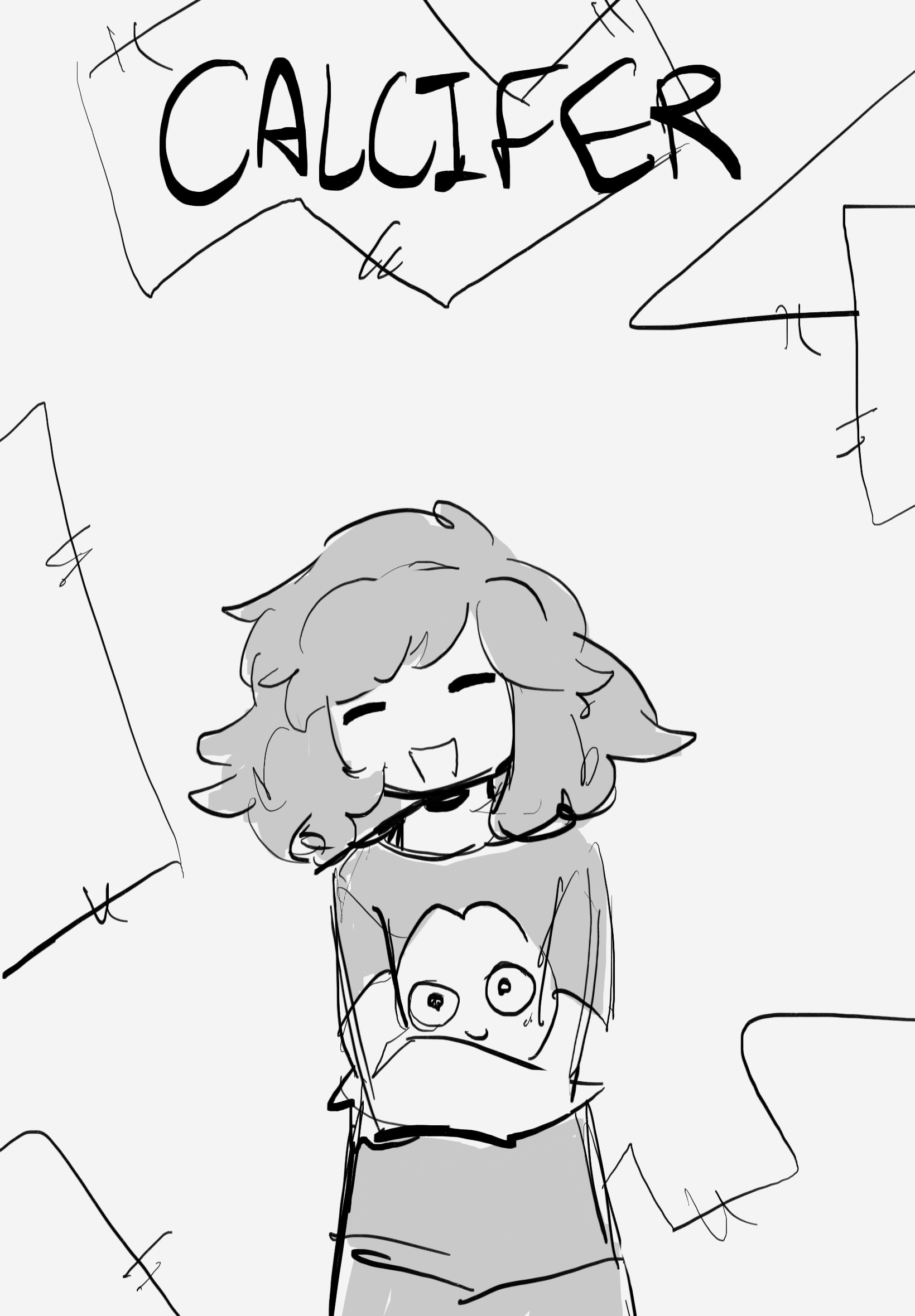
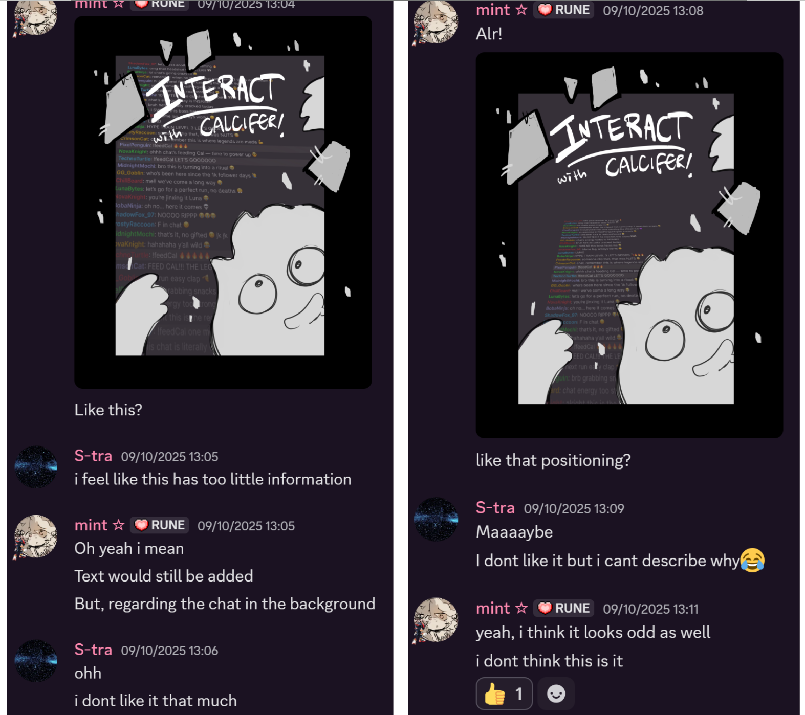
I selected the two concepts the group responded to most positively and produced refined grayscale sketches. While these versions were still uncolored, they were designed to clearly communicate composition, hierarchy, and visual intent without relying on color.
At this stage, I also incorporated feedback from a teammate, including the addition of a stylized chat element in the background to better reference the Twitch context. Although I felt the designs still had room for improvement, I prioritized clarity and readability over visual polish.
Result
Both concepts were well received during feedback sessions, including positive responses from the instructor. However, after group discussion, neither of my designs was selected as the final poster direction.
Reflection
This phase reinforced an important professional lesson: strong ideas do not always move forward, and design is ultimately a collaborative process. While my concepts were not chosen, the experience strengthened my ability to iterate on feedback, advocate for my ideas, and remain open to alternative solutions—an essential mindset in creative teamwork.
Asset Creation & Collaborative Execution
Situation & Task
Once the final poster direction was selected based on my groupmate’s concept, the focus shifted to production. My role was to contribute by creating illustrated assets that aligned with the chosen design.
Action
I began developing the required visual assets through initial sketches, following my usual illustration workflow. Throughout this process, I closely coordinated with the groupmate leading the poster design, sharing sketches and awaiting confirmation before moving forward. This ensured that my illustrations matched the overall visual direction and integrated seamlessly into the final layout.
Result
The approved sketches formed the basis for the final drawn assets used in the poster, supporting a cohesive and consistent visual style.
Reflection
This stage highlighted the importance of flexibility and communication in collaborative design work. Even when working from another person’s concept, maintaining a shared visual language and feedback loop was key to achieving a strong final result.


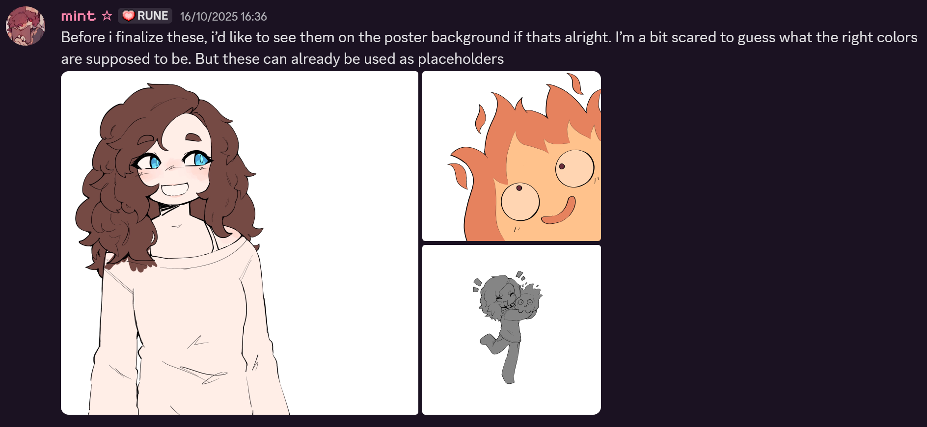
Color Testing & Mockup Validation
Situation & Task
During the asset production phase, I reached the coloring stage of the illustrations. At this point, it became important to ensure that the chosen colors would work harmoniously within the full poster composition.
Action
Halfway through coloring the assets, I asked my teammate to create a rough mockup of the poster to test how the illustrations interacted with surrounding elements such as typography, background, and layout. This allowed me to evaluate contrast, readability, and overall visual balance in context rather than in isolation.
Result
The mockup provided early insight into how the color palette performed within the full design, helping identify potential adjustments before finalizing the assets.
Reflection
This step reinforced the value of testing assets in context early on. Creating a mockup mid-process helped prevent avoidable revisions later and ensured the illustrations supported the overall design rather than competing with it.
Final Asset Delivery & Visual Consistency
Situation & Task
With the overall poster direction established, the final step was to complete the illustrated assets so they could be fully integrated into the design.
Action
I finalized the assets with a focus on clean shapes and minimal shading. I intentionally avoided heavy rendering, as excessive shading would have conflicted with the fresh, colorful tone of the project. Additionally, the in-stream widget itself was designed to be relatively simple and stylized, so maintaining a lower level of detail helped prevent visual inconsistency or confusion between assets.
Result
The completed illustrations integrated smoothly into the poster and supported a cohesive visual identity across both the promotional material and the in-stream game concept.
Reflection
This stage reinforced the importance of stylistic consistency across different deliverables. By aligning the level of detail in the poster assets with the final widget design, the visuals remained clear, readable, and unified.

Iteration & Adapting to Feedback
Situation & Task
After completing the poster design, additional feedback from the primary poster designer indicated that the current outcome did not fully align with their vision.
Action
I quickly developed a new, simplified poster concept, aiming to address the concerns while keeping the design visually clear and engaging. This version was intended to offer a fresh perspective and provide the team with more options to consider.
Result
Although this alternative was ultimately not selected, the exercise allowed the team to continue refining their vision and confirmed the importance of alignment on creative direction.
Reflection
This experience reinforced that iteration is a natural part of the creative process. Even when ideas are not implemented, exploring alternatives strengthens collaboration, adaptability, and problem-solving skills—essential qualities in any design workflow.
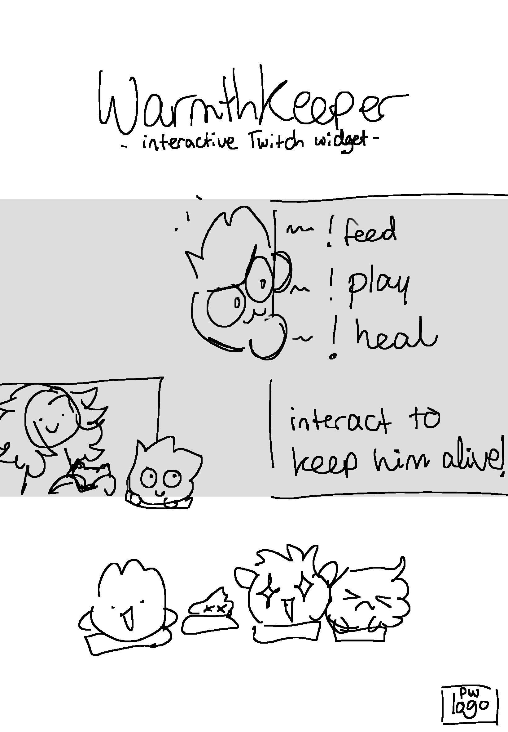
Learning Animation & Collaborative Contribution
Situation & Task
After the poster showcase, our focus shifted to building the actual project. My groupmate and I needed to animate fire effects for the virtual pet game, something I had never done before. The goal was to achieve visually appealing, dynamic animations that fit the playful style of the game.
Action
I dedicated time to learning fire animation techniques, following a tutorial that demonstrated the “bubble-trick” method. I created several test GIFs, including one showing a transformation where the fire loses fuel, to practice timing, movement, and style. While I experimented extensively, I ultimately realized that fire animation was not my strongest skill.
To ensure the project progressed smoothly, I shifted focus to areas where I could make a confident contribution: character expressions, cosmetics, and coloring. Meanwhile, my groupmate handled the final fire animation.
Result
By redistributing tasks based on strengths, the team was able to produce polished fire animations while maintaining my contributions in character visuals and aesthetics. My experiments also informed discussions about timing and style, indirectly supporting the animation process.
Reflection
This experience reinforced the importance of self-awareness and adaptability in collaborative projects. Knowing when to delegate challenging tasks allowed me to focus on areas where I could maximize impact, while still engaging with new skills and learning through experimentation.
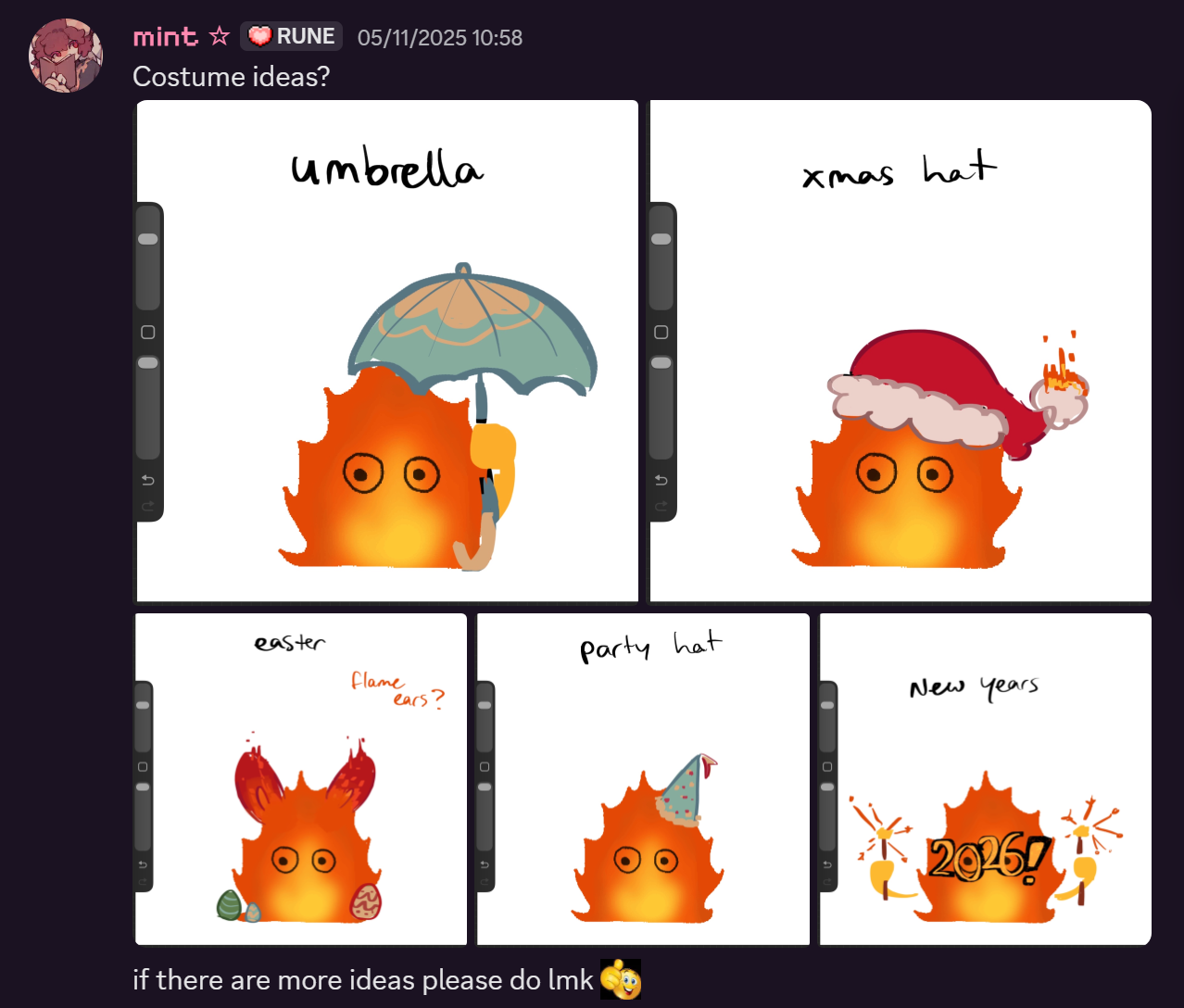
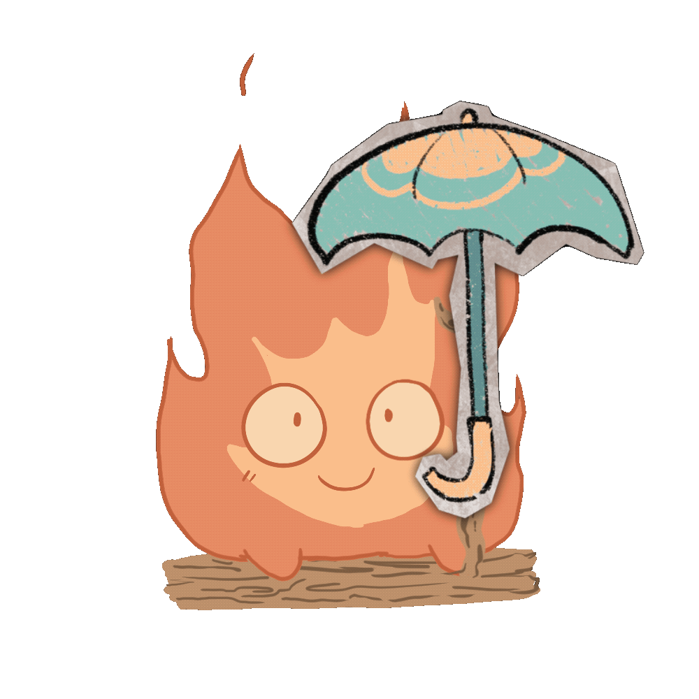
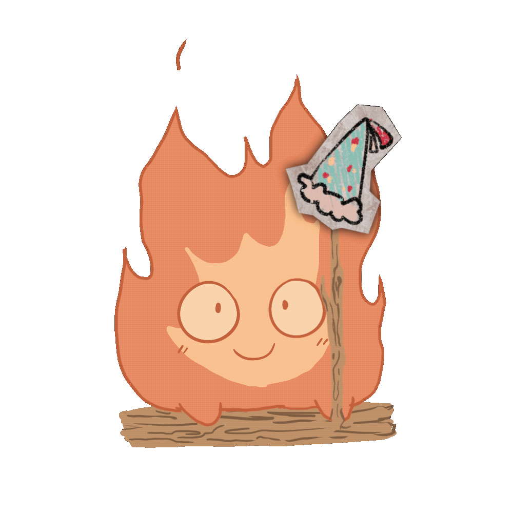
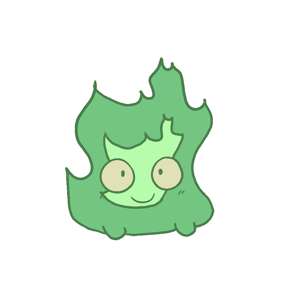
Character Cosmetics Design
Situation & Task
As part of the project, I was responsible for creating cosmetics for the virtual pet, leveraging my interest in decorative design. The goal was to make these accessories engaging and fun while reflecting Desca’s community, events, and celebrations, such as New Year’s or birthdays.
Action
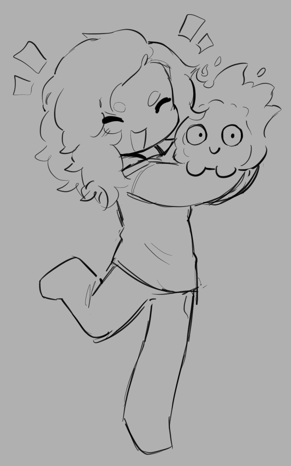
I built upon my groupmate’s Calcifer drawing by designing and adding a variety of accessories. To ensure visual clarity and harmony, I chose a blue color palette that stood out against the character but remained soft enough to avoid being overly vibrant or straining on the eyes.
Result
The cosmetic designs added a playful and customizable element to the virtual pet, enhancing interactivity and giving viewers ways to engage with the character in fun, event-driven ways.
Reflection
This task reinforced the importance of balancing creativity with readability in character design. By carefully considering color and placement, I was able to create visually appealing cosmetics that complemented the existing artwork and supported audience engagement.
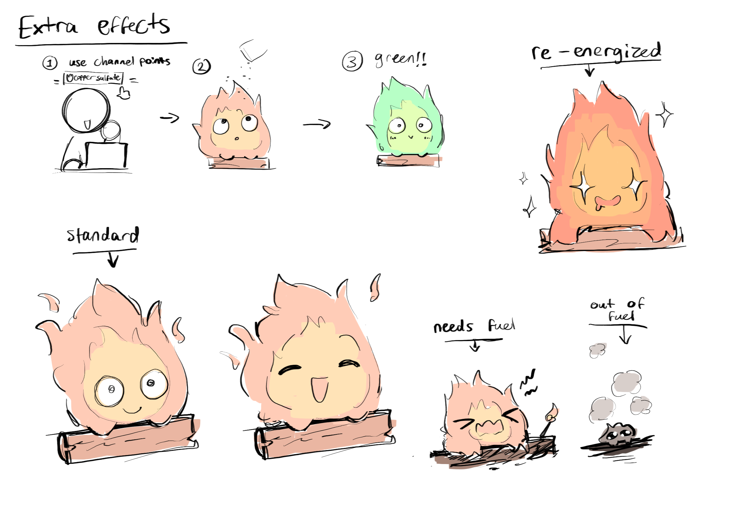
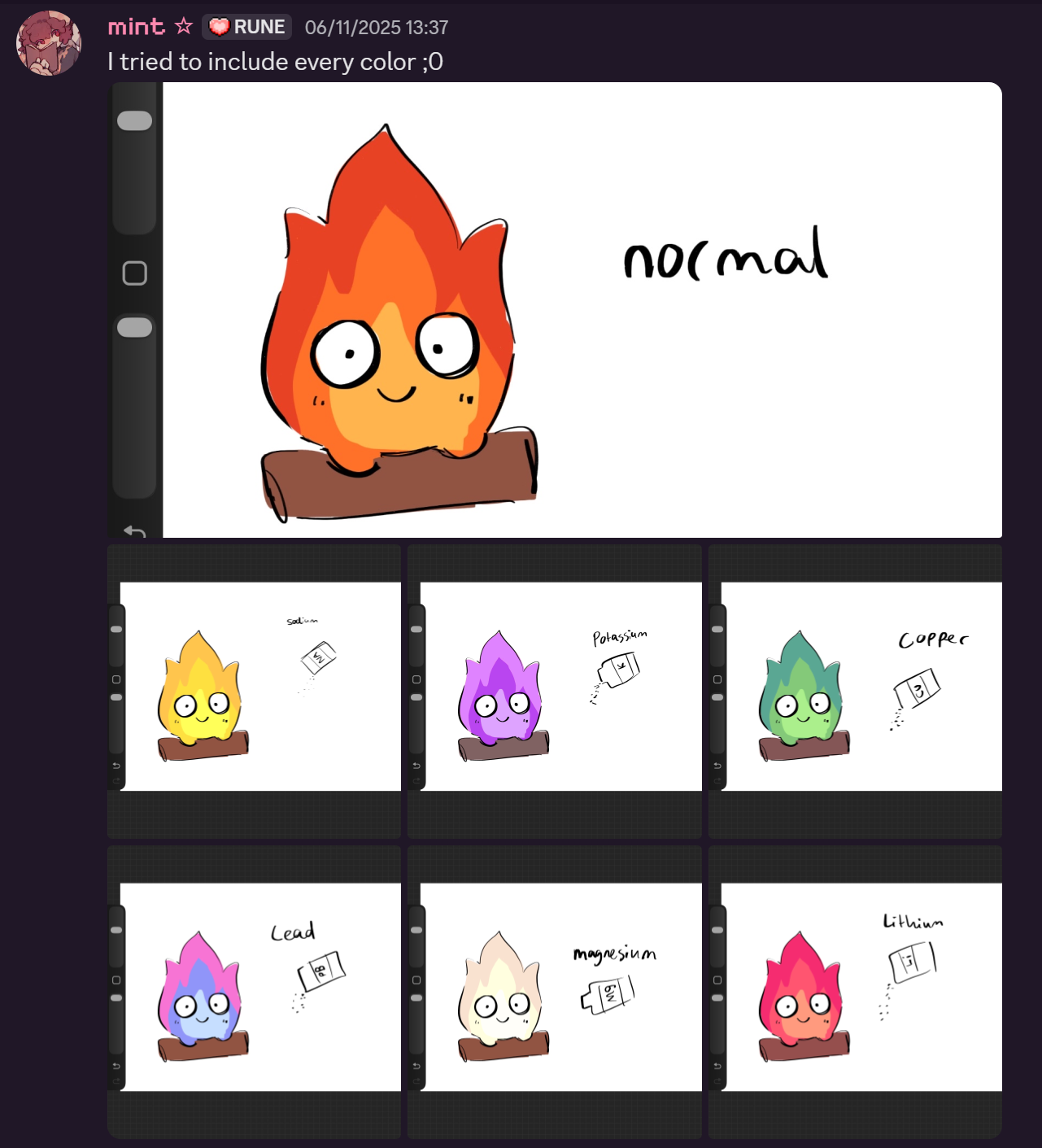
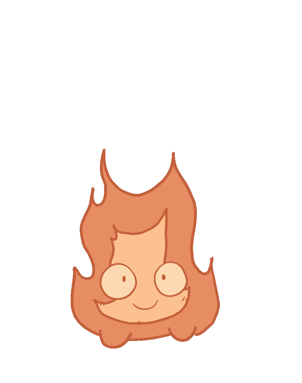
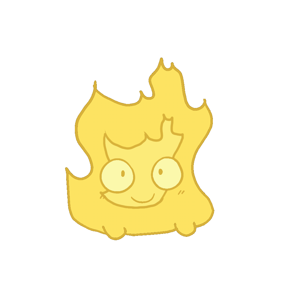
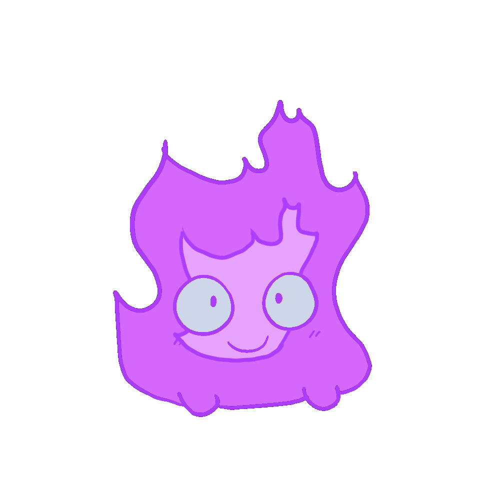
Researching Chemical Reactions & Color Choices
Situation & Task
As part of designing the virtual pet’s chemical reaction effects, I was responsible for selecting and coloring the flames in a way that was visually interesting and varied. The goal was to create a vibrant, engaging experience while maintaining some level of realism in the reactions.
Action
I conducted research on different flame colors and their corresponding chemicals, noting which elements produced which hues. From this, I selected a set of colors I personally liked, while avoiding duplicates to keep the visuals diverse. I also verified whether each reaction was practically possible and whether the chemical could exist in a powdered form, ensuring the effects made sense within the context of the game’s playful logic.
Result
The research informed a cohesive and varied color palette for the chemical reaction animations, balancing aesthetic appeal with a nod to realistic science.
Reflection
This task reinforced the value of research-driven design. Even in a stylized game context, grounding creative decisions in real-world logic can enhance immersion and credibility, while still leaving room for playful interpretation.
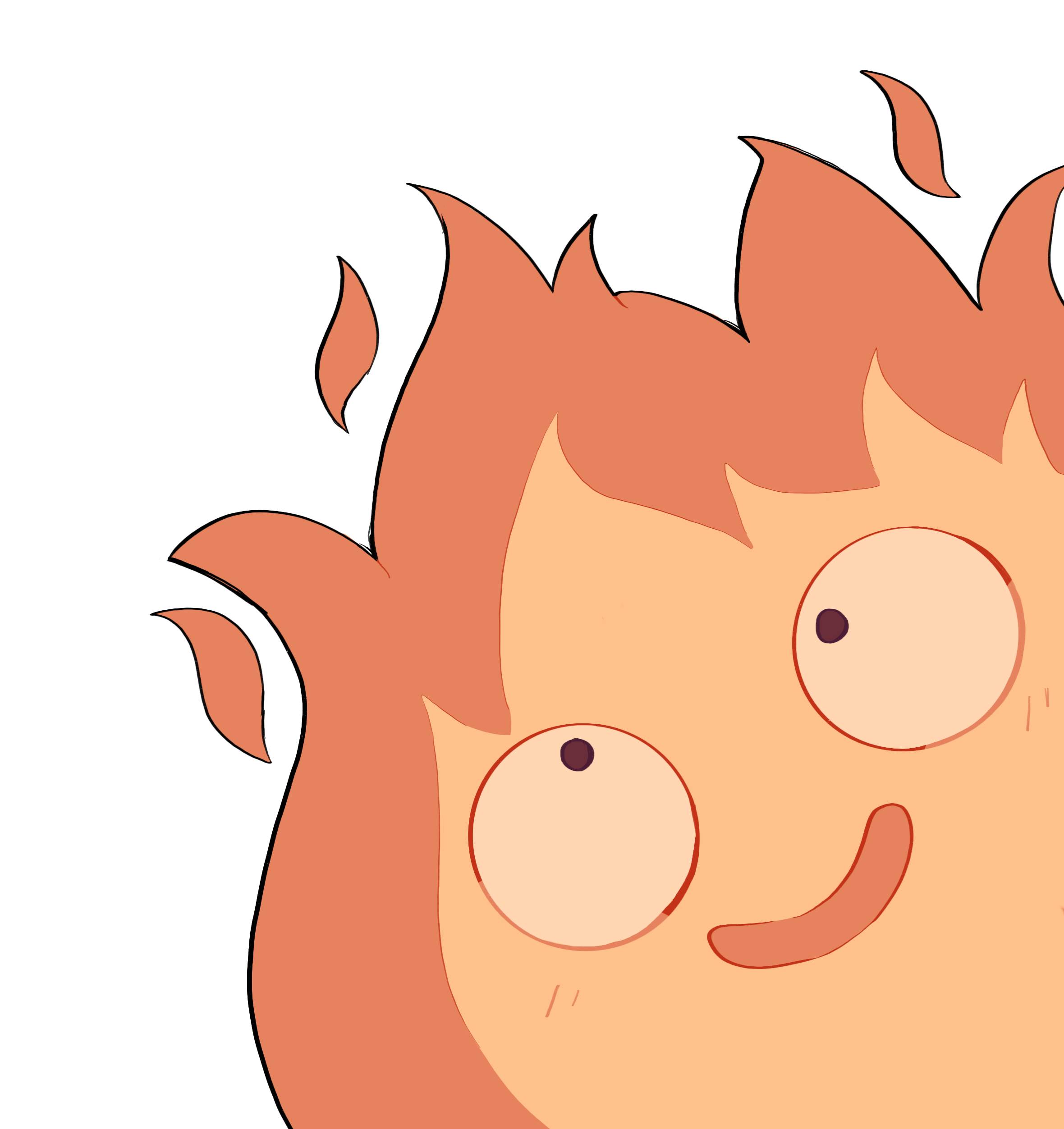
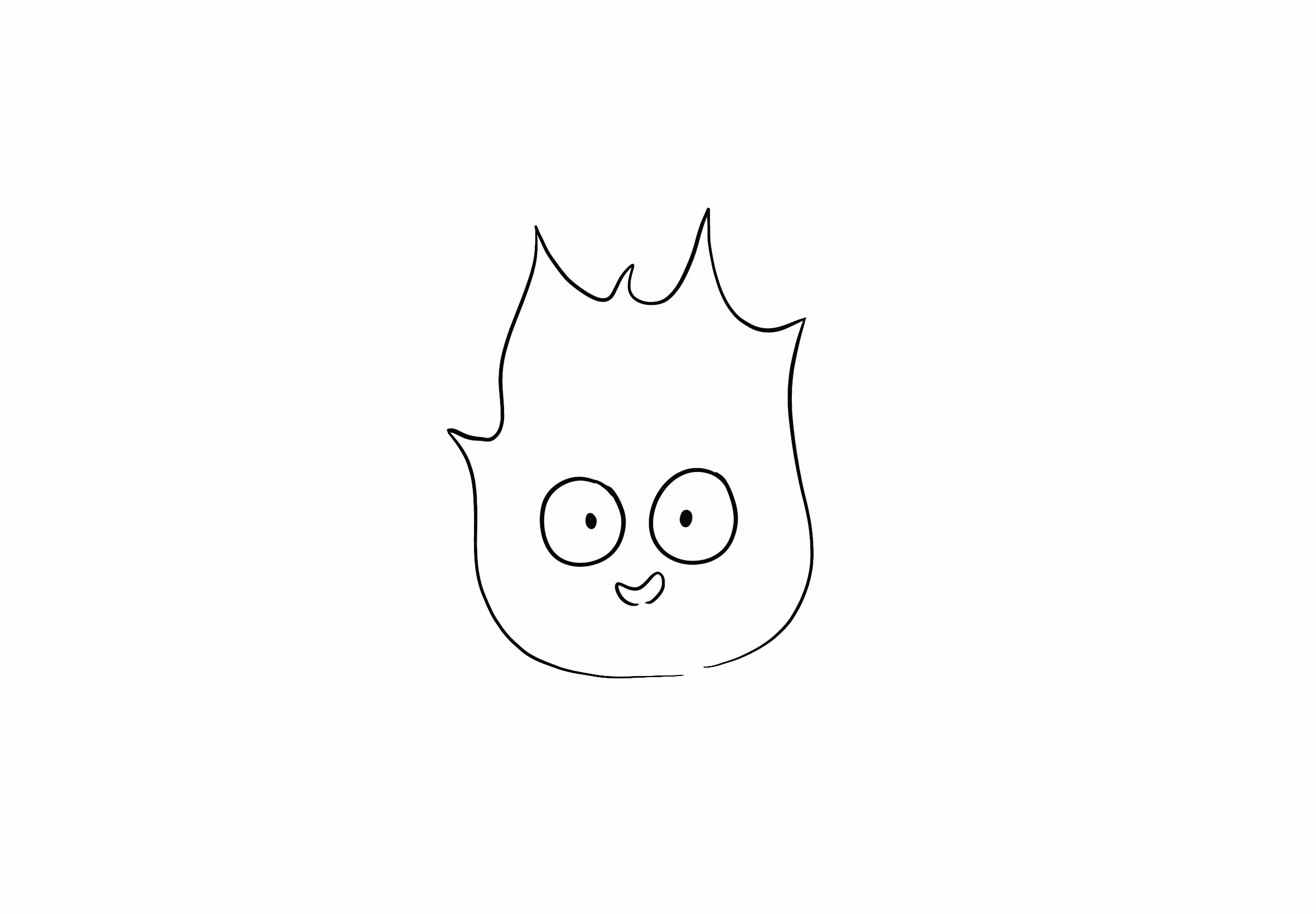
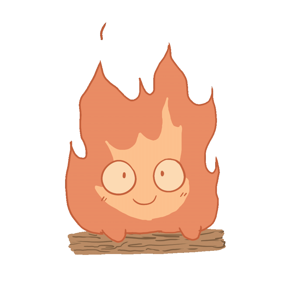
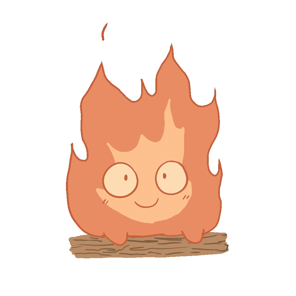
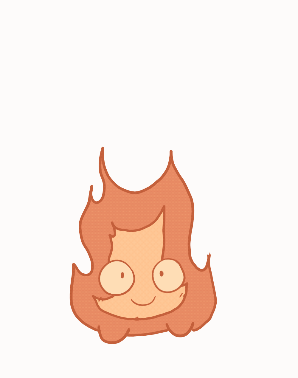
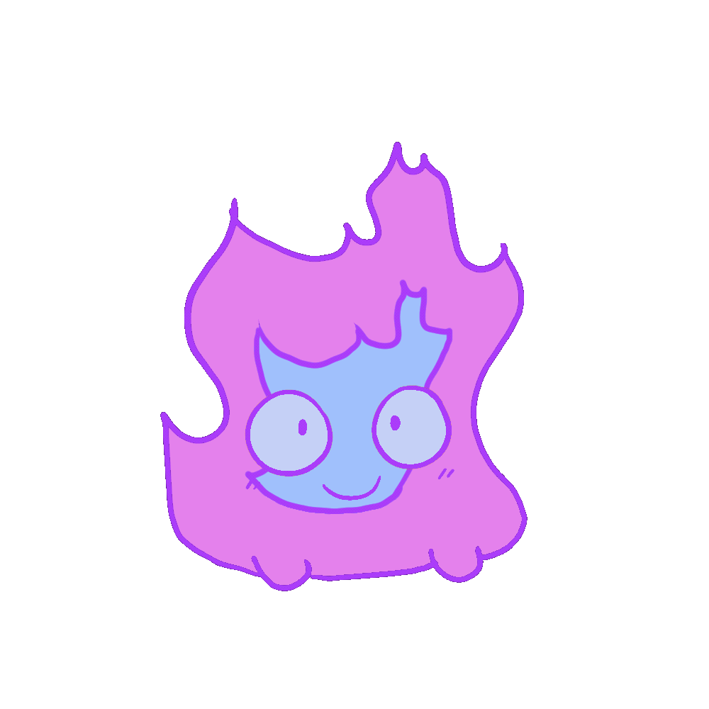
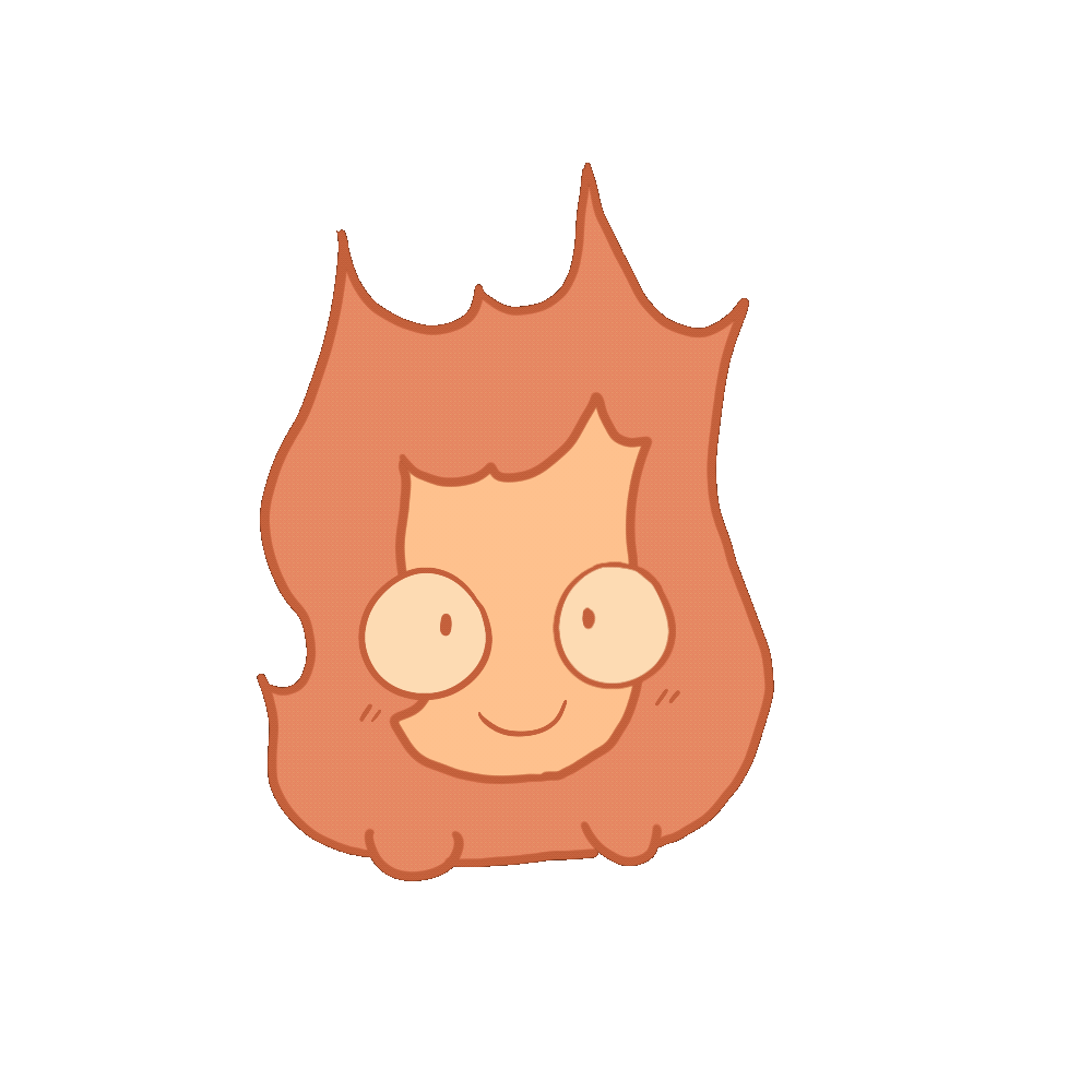
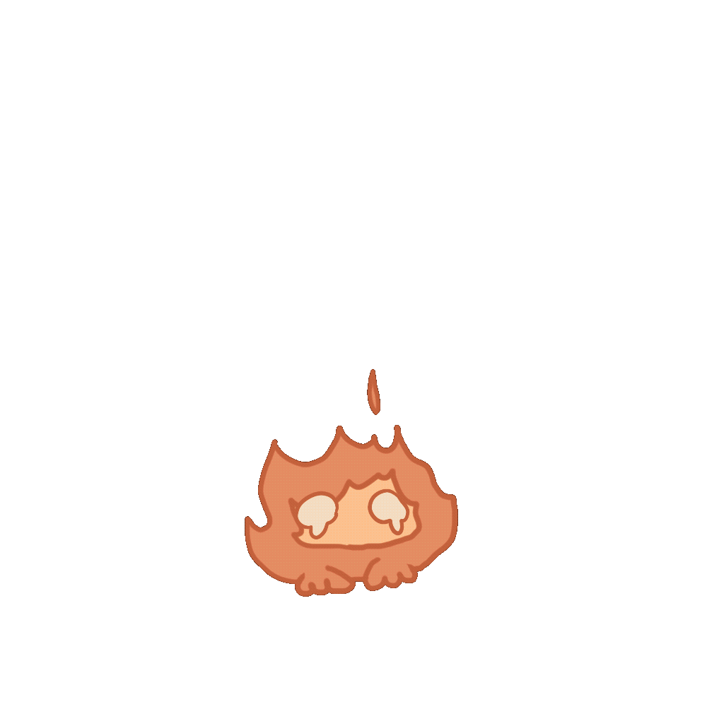
Coloring & Animating Calcifer’s Expressions
Situation & Task
After finalizing the chemical reaction color palette, I received the line art for Calcifer’s idle animation. My task was to color the character and add facial animations to bring personality and life to the virtual pet.
Action
I colored Calcifer using the established palette and added a cute, expressive face. To enhance the sense of life, I incorporated slight wiggling movements in the face. Additionally, following a teammate’s suggestion, I created a “look around” expression to add variety and make the idle animation more dynamic.
Result
The completed animations added charm and personality to Calcifer, helping the character feel lively and engaging during gameplay.
Reflection
This task emphasized how small animation details and expressive touches can significantly increase character appeal. It reinforced the importance of collaboration, as teammate feedback inspired enhancements that improved the final result.
Integrating Cosmetics into Idle Animations
Situation & Task
After coloring Calcifer’s idle animations, the next step was to integrate the cosmetic designs into the animation, allowing the virtual pet to feel customizable and engaging.
Action
I drew two of the cosmetic ideas and placed them on the foreground layer of the idle animation, ensuring they aligned with the character’s movements and maintained visual clarity.
Result
The cosmetics added an extra layer of charm and personality to Calcifer. When I shared the animations with peers, the feedback was overwhelmingly positive, with viewers responding enthusiastically to the additions.
Reflection
This stage reinforced how interactive visual elements can enhance engagement and emotional connection with characters. Testing with others also highlighted the value of informal feedback in confirming design decisions.
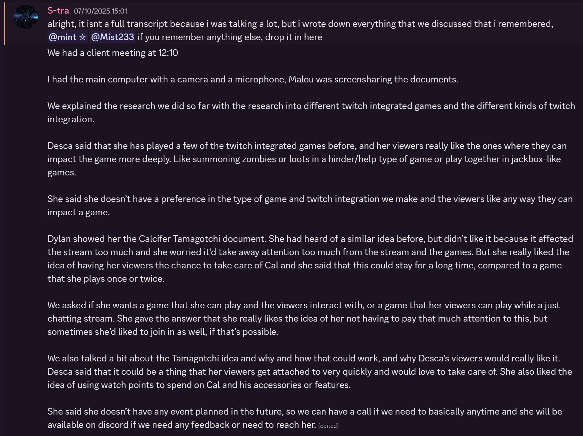
Stakeholder Feedback: Art Review with Desca
Situation & Task
During a later stage of the project, we scheduled a meeting with Desca to present some of the finalized art assets for the virtual pet game. The goal was to gather her feedback and ensure that the visuals aligned with her vision and community aesthetic.
Action
We showcased Calcifer’s idle animations, cosmetics, and expressions, explaining design choices and interactive elements. We also discussed how the art tied into the gameplay and stream engagement.
Result
Desca responded very positively, expressing that she found the character and animations extremely cute and engaging. Her enthusiasm confirmed that the visual direction resonated with the intended audience. An excerpt from the meeting transcript highlights her reaction.
Reflection
This experience reinforced the importance of direct stakeholder feedback in the creative process. Positive validation from Desca not only affirmed design choices but also provided confidence that the project was effectively capturing the desired tone and personality.
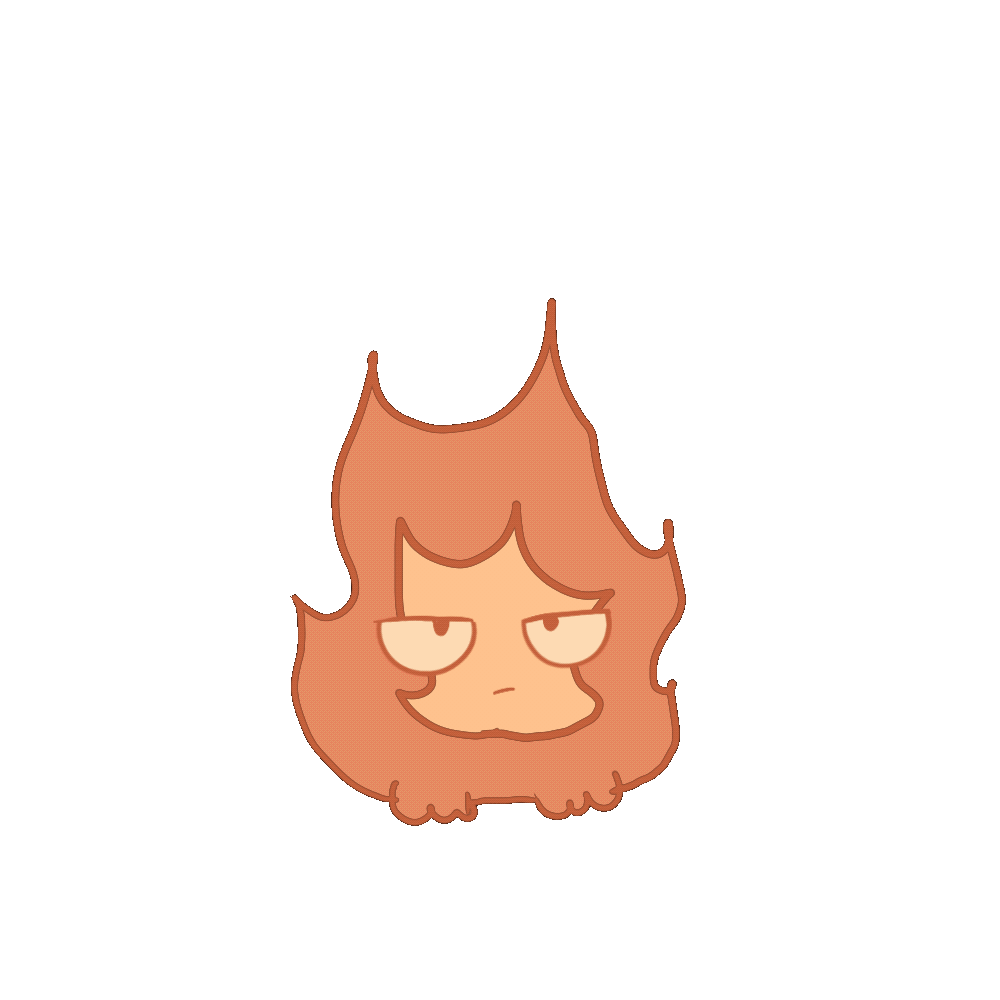
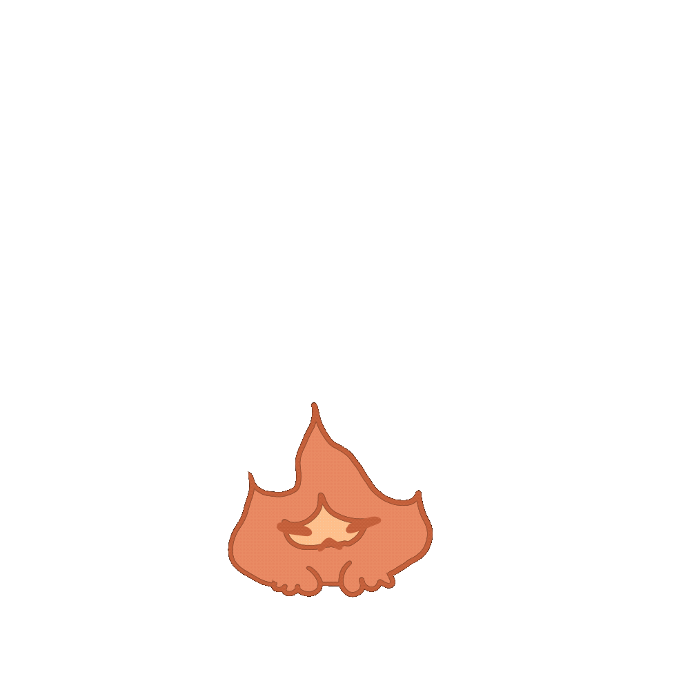
Coloring Chemical Reactions & Adding Expressions
Situation & Task
The next major task was to color the chemical reaction animations and add expressive elements to the virtual pet. The goal was to maintain a cohesive visual style while preparing the animations for further refinement.
Action
I imported the line art into my drawing program and applied the established color palette across the entire animation. I added a face to the character, using the expression from the previously completed idle animation to ensure visual consistency. At this stage, I focused on creating a solid base without altering colors dynamically, providing a foundation for later adjustments.
Result
The completed base animation served as a consistent and cohesive starting point for further expression and coloring work, ensuring that the character’s personality and style remained uniform across different animations.
Reflection
This process highlighted the importance of consistency in character design, especially when managing multiple animations. Reusing established facial expressions helped maintain continuity and saved time while supporting a cohesive visual identity.
Optimizing Chemical Reaction Coloring
Situation & Task
With lots of frames to color for each of the chemical reaction animations, I needed an efficient method to maintain consistency and save time while preserving the established visual style.
Action
I decided to use gradient maps, color-picking from previously completed designs to apply a consistent palette across all frames. Initially, I applied a standard gradient, but after feedback from my teammate—based on advice from an animation-experienced teacher—I refined the approach to follow their recommended technique.
Result
The gradient maps sped up the coloring process and ensured uniformity across frames, providing a solid base for further adjustments and expression work.
Reflection
This stage emphasized the value of tool-based problem-solving and collaborative feedback. Even if the visual difference felt subtle, applying the recommended approach reinforced the importance of exploring new techniques and integrating expertise from peers and mentors.


Coloring the Full Set of Chemical Reactions
Situation & Task
After completing the first chemical reaction animation, I was ready to color the remaining reactions, ensuring consistency across all frames and maintaining the established visual style.
Action
I applied the previously developed gradient maps and color workflow to the remaining animations. The process was repetitive and required careful attention to detail, but it allowed me to reinforce consistency and efficiency throughout the project.
Result
All chemical reaction animations were fully colored and visually cohesive, forming a complete set that could be integrated into the virtual pet game.
Reflection
Although the task was mentally intensive, it was a rewarding experience that highlighted the importance of patience, consistency, and process-oriented thinking in animation production.


Finalizing Chemical Reaction Animations
Situation & Task
As the project neared completion, my teammate finished the line art for the “reaction wears out” animations, where Calcifer returns to his normal state. My task was to color these animations and add expressive elements, maintaining visual consistency with the earlier chemical reactions.
Action
Building on my experience with the previous animations, I colored the frames efficiently, ensuring the colors remained vibrant and cohesive with the established palette. I also created matching expressions for Calcifer, keeping his personality consistent throughout the transformation.
Result
The fully colored and animated sequences seamlessly completed the chemical reaction set, enhancing the interactive and engaging feel of the virtual pet. The expressions added charm and life, contributing to a polished, cohesive final product.
Reflection
This stage reinforced how prior experience and workflow familiarity can streamline production while maintaining quality. It also highlighted the importance of consistency in character design across multiple animations to create a unified visual identity.
Easter Bunny Animation
Situation & Task
As part of the holiday celebration events designed to bring the community together,
Easter was selected as an example,
and my task was to create a themed animation that felt festive and engaging.
Action
I developed a bunny animation and,
during the sketch phase, realized that the bunny moving off-screen felt less effective,
so I revised the motion during the lineart stage to be more vertical and bouncy,
having the bunny briefly peek out before disappearing.
Result & Reflection
The updated animation felt more playful and polished,
better capturing the holiday spirit,
and this iteration reinforced the value of refining motion early to improve clarity and visual appeal.

Final Presentation Preparation
Situation & Task
As we prepared for the final presentation,
my task was to complete the remaining visual assets by coloring the last of Hanna’s linearts,
adding expressive details, and finishing two additional cosmetic items.
Action
I colored the final linearts, incorporated cute and cohesive expressions to enhance character appeal,
and completed the remaining cosmetics using the same workflow and visual standards established earlier in the project.
Result & Reflection
The assets were completed smoothly and consistently,
reinforcing the effectiveness of the established process and ensuring the project was visually polished and presentation-ready.
Final Presentation
Situation & Task:
The time for the final presentation arrived, which took place in TQ in Strijp,
and my task was to present our work to an audience that included fellow students and Desca herself.
Action:
Despite feeling extremely nervous about presenting in a new environment and to a big audience,
I focused on staying composed and delivering the presentation to the best of my ability.
Result & Reflection:
Although the experience was emotionally challenging, I successfully completed the presentation,
and the response to the art was very positive—the audience especially connected with the expressions I created,
becoming attached to the characters as intended, which validated both the creative choices and the effort put into the project.
FINAL REFLECTION
I’m genuinely satisfied with how the project turned out, especially because I really enjoyed working with my group. They were incredibly kind and supportive, particularly during the final presentation when they noticed I was anxious and made sure I was okay, which meant a lot to me. I felt comfortable collaborating with them and appreciated the teamwork throughout the project. While I personally feel like I could always do more, that’s a feeling I tend to have with most projects. Looking at it objectively, though, I contributed a solid amount of work and have plenty to show for it. If future projects go in a similar way, I would be very happy.